Communicating Your Personal Brand Identity Through Math. Wait? What?
Imagine you're in your HS math class and your teacher tells you that you're going have to convey your emotions through math. Wait? What?
Introducing “The Line Logo Project” by TEA Math and Science Teacher Natalie Bladis.
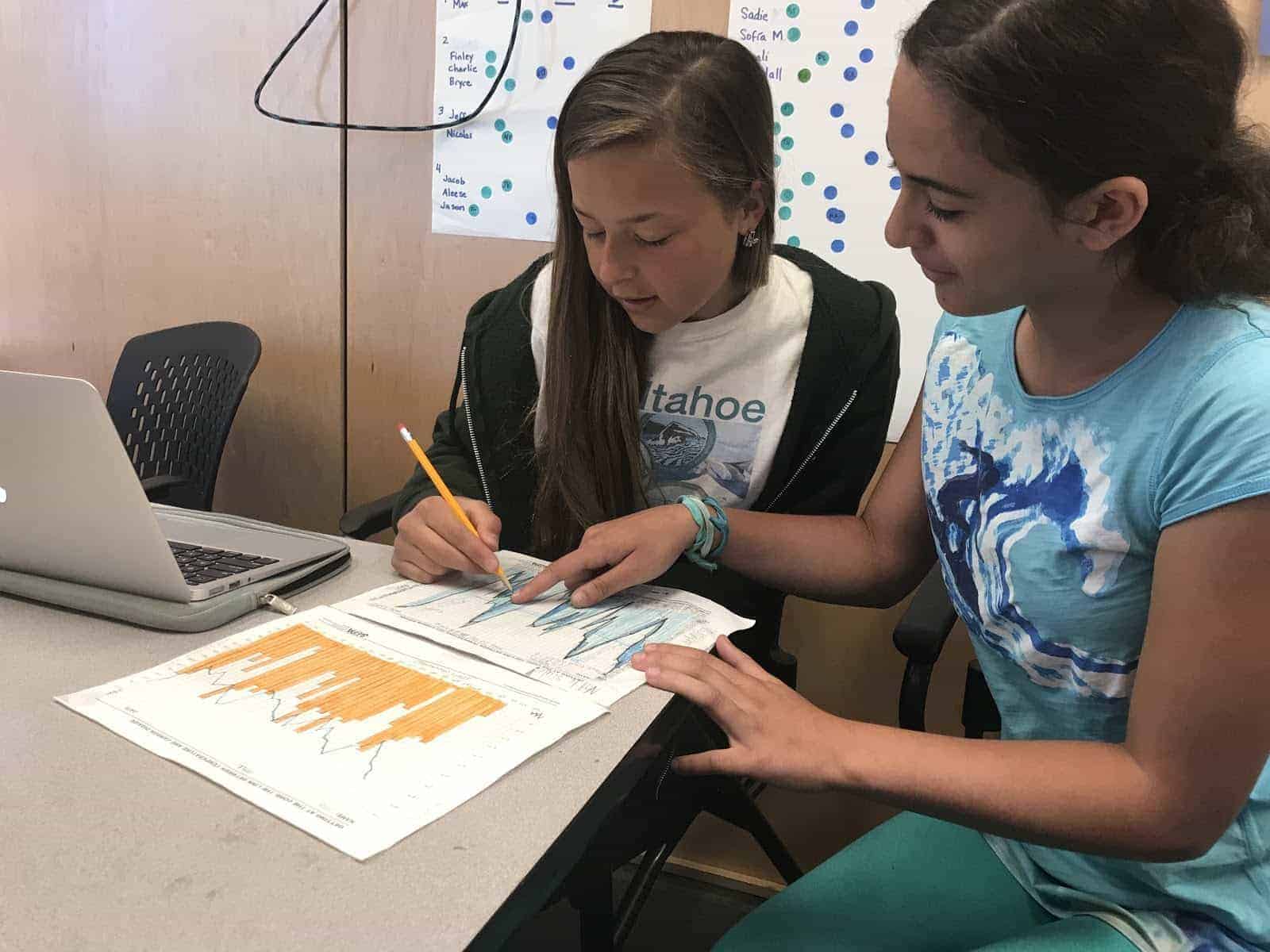
In this project, our HS math students were challenged to design a line logo that captured their story and identity or “brand” so to speak. The final products for this project were to be a written report describing the system of equations that created their logos and a powerpoint presentation, delivered to the entire class, describing how their logos represented them and the math behind it.
Many logos that graphic designers create are a series of lines with restricted domains. To make the logos symmetric and visually appealing, many line logos incorporate parallel and perpendicular lines. Drawing line logos “free hand” (without the use of a ruler or grid) is difficult. If one line is off even by a little bit, the whole logo looks unprofessional. To make creating line logos easier, graphic designers create these logos on a grid. Our students constructed equations of lines with restricted domains to create their final products.
Learning Targets Assessed:
– I can analyze and organize information (including numerical and visual) to answer a question or solve a problem.
– I can use discipline-appropriate conventions to support a clear expression of ideas and information.
– I can complete and submit assignments on time.
– I can use appropriate tools to understand and analyze situations and to improve decisions.
– I can communicate ideas and contribute to discussion/project through participation, questioning, connecting, and probing.
The final products are outstanding. And as promised, effectively communicate each student's personal brand through math. Well done! Here are a few examples - enjoy!
Ben: This is my logo, It represents me because living and riding in Alaska is arguably my favorite thing to do. I have learned lots with responsibility and many smaller skills in the backcountry while riding up there.
Kensi: My line logo is based on yin-yang and the kanji of heart (Xīn). I chose the yin-yang because of what it represents. It’s a very old symbol that originated from Taoism representing life. The “yin” is the black and the “yang” is white. There is a dot of each color in each other. Overall it is a unique symbol and is nice to look at. I chose a “heart” because I like to follow my heart.
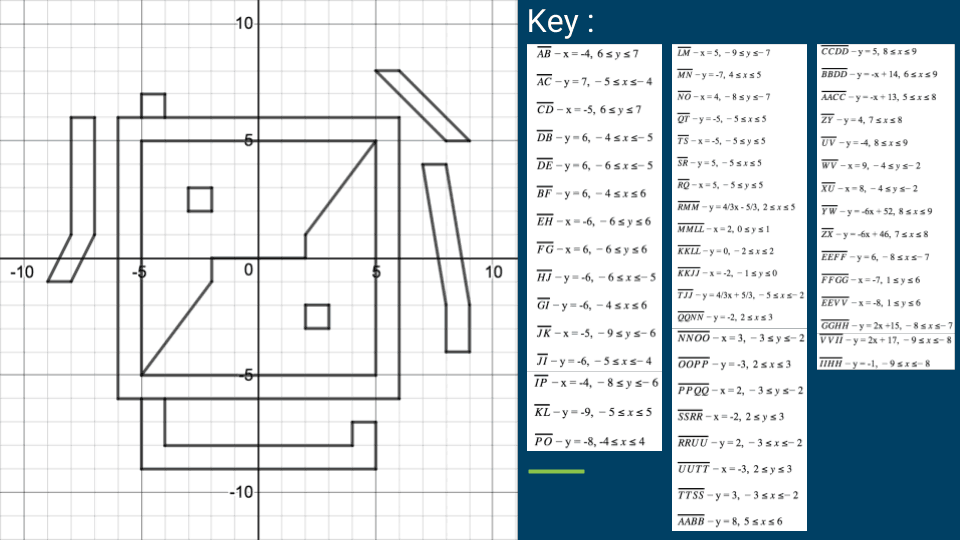
Amanda: This is a graph of San Francisco’s Skyline. This graph represents me because when I was little and lived in the bay area I would always go into the city with my parents and friends. I think that going to the city shaped how I am today by exposing me to many cultures and the hustle and bustle of the big city. As opposed to Tahoe and Marin.
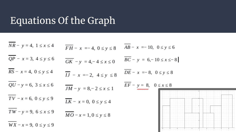
Logan: I made this logo because I really love the look of the Japanese alphabet and the Japanese culture in general. My character that I made into a logo means Azuma which, in english, means East. I am not fully sure why I chose the word East over North or South, but the east is where the sun comes up, and my grandpa told me once that because I’m so tall, I would be able to see the sun come up before anybody else, and that sort of stuck with me, so that is why I chose it.
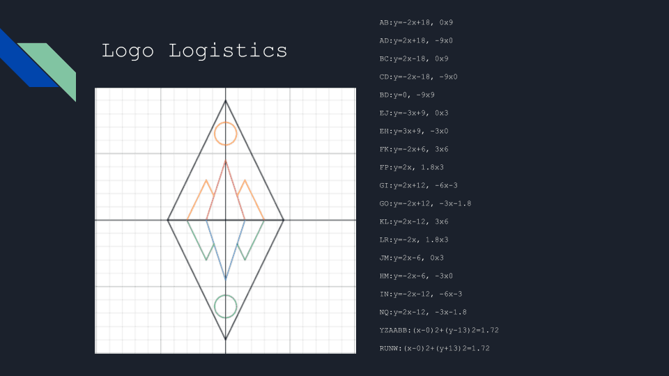
Olivia: I designed my logo to represent two sides, a sunrise reflected in the water as a sunset. I also incorporated mountains because of my love for nature and its untouched beauty. I used a sunrise and sunset to show how two very different things could both be beautiful in a unique way and to represent the beauty of the beginning and the end.
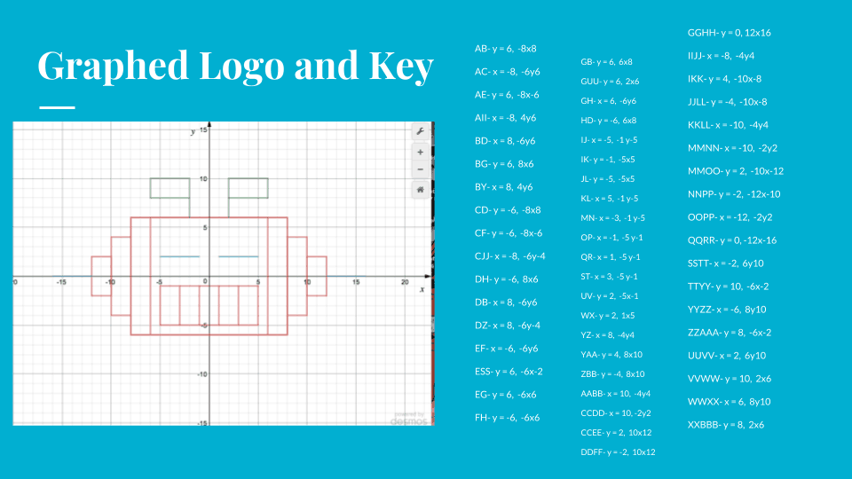
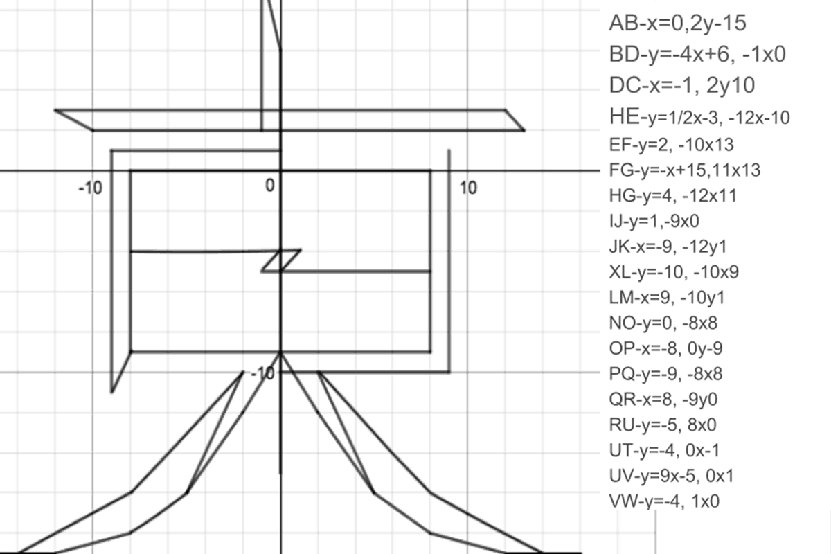
Sydney: I really like robots/ I think robots are cool. My robot is blue, red and green because those are my favorite colors
My robot is sleeping /its eyes are closed because sleeping is my favorite hobby.
